Professional handbook

The Blueprint: Build a component library.

Product language: German. An English edition is planned.

The handbook for teams that plan, build, or overhaul their own component library: architecture, design tokens, accessibility, one element for all frameworks, and operations over many years. A practical handbook by powerbunch GmbH with 74 code examples, 34 checklists, a working reference project, and Mosaik as a publicly documented case study.

  • 279-page handbook
  • 16 chapters
  • 74 code examples
  • from €390 plus VAT
Table of contents of the handbookCover page of the handbookPage with a code example from the handbook

01Who the handbook is for

A library is a product, not a project.

Anyone building a component library makes decisions that must hold up for years. The handbook provides the criteria and proven patterns for those decisions and highlights typical mistakes before they become expensive.

  • Several applications should look and behave the same, even across different frameworks.
  • You are deciding whether to build a library yourself, adapt an existing one, or buy one.
  • An organically grown library is hard to maintain, and theming and accessibility are missing.
  • Management expects a business case with a budget estimate, team structure, and roadmap.

Hardly anyone reads a handbook of this size from cover to cover. Three reading paths lead to a tangible result, depending on your role.

01

Decision

CTO, division leaders, budget owners, technical product owners

Chapters01, 02, 15, 14, 16, appendix A

A reasoned choice between building, adapting, and buying, with a budget estimate, team structure, and roadmap

02

Architecture

Frontend lead, people responsible for architecture

Chapters01, 03, 04, 05, 06, 07, 08, 09, 13, appendix A

Sound fundamental decisions, recorded as ADRs, and a package structure for all frameworks

03

Implementation

Library development team, design, accessibility

Chapters01, 03, 04, 05, 06, 07, 10, 11, 12, 13, appendix A

Components that are tested, documented, accessible, and published

02The contents

16 chapters, from the decision to operations.

Each chapter ends with a summary of the key points. Appendix A bundles the most important checkpoints into thematic checklists for projects, reviews, and releases. Appendix B explains the technical terms in the glossary.

01How to use this handbookThis chapter clarifies the terms, shows three reading paths through the book, and introduces the reference project and the Mosaik case study.6
  1. What a component library is
  2. Who this handbook is for
  3. Three reading paths through the book
  4. The reference project
  5. The Mosaik case study
  6. Conventions in this book
02Build your own library, adapt one, or buy one?This chapter provides the criteria, realistic options, and a transparent cost calculation for the fundamental decision.6
  1. Asking the right question
  2. Five decision criteria
  3. The realistic options
  4. Total costs over five years: an estimate
  5. Business case and risks
  6. Exit strategy: plan how to leave before you commit
03Architecture and fundamental decisionsSome decisions can hardly be reversed after the first release: platform, base library, encapsulation, package structure, browser baseline, names, and build.8
  1. Why web components are the common foundation
  2. Lit 3 as the foundation and the alternatives
  3. Shadow DOM, light DOM, or both
  4. Repository, packages, and dependencies
  5. Defining the browser baseline
  6. Names, prefixes, and the custom element registry
  7. TypeScript and decorators
  8. Build, modules, and tree shaking
04The component modelA component is only as good as its public API.8
  1. The public API as a contract
  2. Attributes and properties
  3. Events
  4. Slots, sub-elements, and parts
  5. Reusable behavior with controllers and mixins
  6. State and form participation
  7. Focus and lifecycle
  8. Performance and definition of done
05Design tokens and themingDesign tokens give design decisions names and make them verifiable and readable by tools.8
  1. What tokens are and what they are not
  2. Three levels: base, semantic, and component
  3. The DTCG format 2025.10
  4. The token pipeline from JSON to CSS, TypeScript, and Tailwind
  5. Color ramps, OKLCH, and contrast
  6. Themes and color schemes at runtime
  7. Component tokens, density, shape, and typography
  8. Alignment with Figma
06Styling and customizabilityShadow DOM protects components from external styles, making an explicit styling API necessary.8
  1. Encapsulation through shadow DOM and its consequences
  2. The public styling API as a contract
  3. Variants, sizes, and density
  4. Light DOM, Tailwind, and global styles
  5. Constructable stylesheets and performance
  6. Focus, high contrast, and writing direction
  7. Versioning the styling API
  8. Typical mistakes and checklist
07AccessibilityAccessibility is largely built into the components rather than the applications.8
  1. Why the library is the most effective place
  2. Patterns from the ARIA Authoring Practices Guide
  3. Shadow DOM: pitfalls and solutions
  4. Keyboard and focus
  5. Focus management in overlays
  6. Forms: labels, errors, and validation
  7. Motion, contrast, and forced colors
  8. Testing and documenting
08One element for all frameworksThe custom element is the single source; all framework packages are thin, generated adapters.8
  1. One source, many thin adapters
  2. The Custom Elements Manifest as a contract
  3. Architecture of a wrapper generator
  4. React: native support, yet wrappers are still needed
  5. Angular: standalone components, signal inputs, and forms
  6. Vue 3 and Svelte 5
  7. Type definitions and server-side rendering
  8. Wrapper testing and acceptance
09The foundation: services beyond the componentsComponents need shared services for overlays, language, dependencies, drag and drop, layout, motion, and icons.8
  1. What belongs in the library and what in the application
  2. Overlays, portals, and positioning
  3. Internationalization
  4. Dependency injection and router
  5. Accessible drag and drop
  6. Layout and motion: breakpoints, container queries, and animations
  7. Icons: registry, on-demand loading, and licenses
  8. Decision aid: does this belong in the library?
10Quality: tests and checksA library is used by many applications, and every bug reaches all of them at once.8
  1. Test strategy for a library
  2. Component tests in a real browser
  3. Interaction, accessibility, and cross-browser testing
  4. Visual regression
  5. API stability and types
  6. Wrappers, packages, and budgets
  7. The CI pipeline
  8. Definition of done and typical mistakes
11Documentation for humans and machinesA component library is only as good as what others can learn about it.7
  1. Types of documentation and their readers
  2. The API reference from the manifest
  3. Examples, playground, and documentation platform
  4. Writing guidelines: descriptions with meaning
  5. Documentation for AI assistants
  6. An MCP server for the design system
  7. Quality assurance of the AI documentation
12Tools for working with the libraryComponents alone do not make a design system usable.7
  1. Which tools are worthwhile when
  2. Playground per component
  3. Themes: editor, generator, palettes, contrast, and audit
  4. Token bridge, motion, and typography
  5. Visual designer, recipes, and starter templates
  6. Icon gallery and AI context generator
  7. Sequence and dogfooding
13Publishing, versioning, and distributingA component library is only as reliable as its releases.7
  1. Semantic versioning for component libraries
  2. Changesets: versions and changelogs in the monorepo
  3. The package format: ES modules, exports, types, and manifest
  4. Choosing the registry
  5. CDN delivery and import maps
  6. Deprecation, migration guides, and codemods
  7. Release notes, pipeline, and provenance
14Operations and governanceThis chapter shows how a component library stays alive after the first release: team model, roles, contribution process, decision records, support, metrics, communication, funding, and lifecycle.7
  1. Team models and roles
  2. Contributions and decisions
  3. Roadmap, prioritization, and support
  4. Measuring adoption without inventing numbers
  5. Communication: changelog, release notes, and office hours
  6. Funding and internal cost allocation
  7. Lifecycle of components
15Roadmap: your own library in 12 monthsThis chapter translates the blueprint into a roadmap with four phases, milestones, and acceptance criteria.8
  1. The roadmap at a glance
  2. Overhauling an existing library
  3. Phase 1, months 1 to 2: foundation
  4. Phase 2, months 3 to 6: core components
  5. Phase 3, months 7 to 9: expansion and frameworks
  6. Phase 4, months 10 to 12: maturity and operations
  7. The first 25 components in an order supported by a rationale
  8. Team structure and smaller teams
16Mosaik case studyMosaik publicly documents what a framework-independent component library can look like on a large scale.6
  1. Fact sheet
  2. Origins: four eras and one lesson
  3. The key decisions
  4. What other teams can adopt and what they cannot
  5. Outstanding issues from a buyer's perspective
  6. Lessons
AAppendix A: checklistsThe handbook's most important checklists in one place, to check off in projects, reviews, and releases.10
  1. Ready for your own library
  2. Architecture decisions
  3. New component: definition of done
  4. Design tokens
  5. Accessibility per component
  6. Framework wrappers
  7. Release
  8. Deprecation
  9. Documentation
  10. Governance
BAppendix B: glossaryThe handbook's most important technical terms in alphabetical order, each briefly explained.7
  1. A to B
  2. C
  3. D to E
  4. F to K
  5. L to P
  6. R to S
  7. T to Z

03A look inside

Decisions instead of opinions.

Where there are several approaches, the handbook compares them side by side and explains the rationale for its recommendation. Four types of callouts put the information in context.

  • Practical insights: experience and proven approaches.
  • Pitfall: typical mistakes and their consequences.
  • How Mosaik does it: documented solutions from the case study.
  • Key points at a glance: the core messages at the end of each chapter.
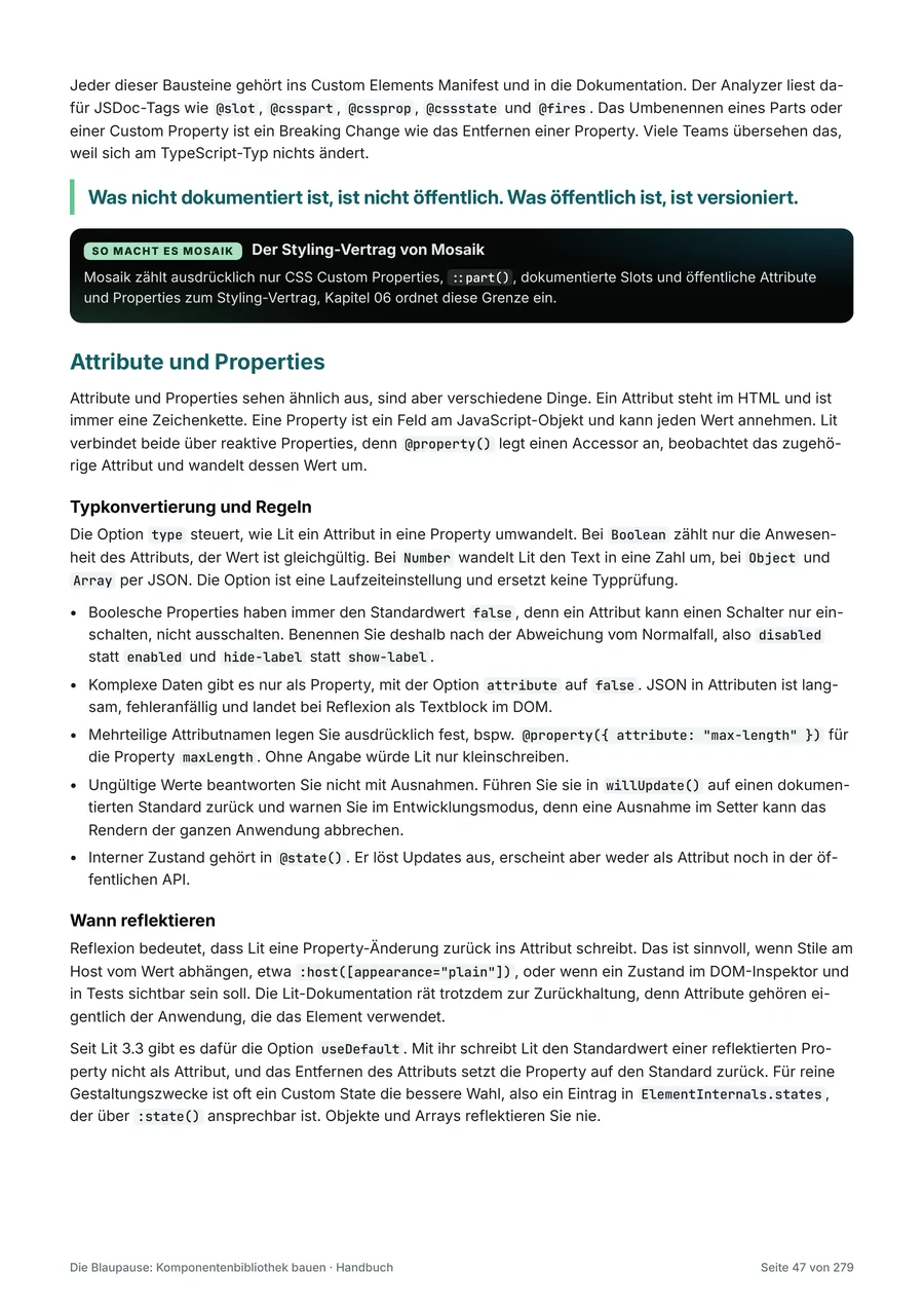
First page of chapter 01"Four paths to a component library" page from chapter 02Page with a code example from chapter 04

Before you buy, check whether the depth and approach suit your team. The sample contains the reading paths, the total cost calculation with explicit assumptions, and a complete component example, all on original pages from the handbook.

Open sample (PDF, German) (opens in a new tab) 836 KB

04The reference project

Try out the architecture.

The handbook comes with a working monorepo that shows the core architecture using three Lit components: design tokens and themes, generated wrappers for four frameworks, a starter for each framework with the same form, component tests, and CI. The code follows the examples in the handbook, and you may incorporate it into your own software.

  • Design tokens in DTCG format, from which light and dark themes are generated
  • Three custom elements based on Lit 3 (ds-button, ds-switch, and ds-text-field)
  • Generated wrappers for React, Angular, Vue, and Svelte
  • A starter with the same form for each of React 19, Angular 22, Vue 3, and Svelte 5
  • Component tests in the browser with accessibility checks, CI pipeline, and release workflow
  • For each part of the project, the matching chapter in the handbook

To run it: Node.js 22.22.3 or later in the 22 release line, 24.15 or later in the 24 release line, or version 26 or later, pnpm 11, and an internet connection for installing the packages.

ds-reference-project/
  packages/
    foundation/      registration helper
    themes/          tokens, light and dark
    elements/        three custom elements
    react/           generated wrappers
    angular/         wrappers, reactive forms
    vue/             wrappers with v-model
    svelte/          wrappers with bind:value
  apps/
    starter-react/   React 19
    starter-angular/ Angular 22
    starter-vue/     Vue 3
    starter-svelte/  Svelte 5
  scripts/           wrapper generator
  docs/              remediation inventory
  .github/workflows/ CI and release
Structure of the reference project, abridged

05The case study

Learning from a large library.

Mosaik publicly documents what a framework-independent component library can look like on a large scale. Chapter 16 derives the key decisions and separates what other teams should adopt from what only works at this scale.

  • 347UI elements according to the showcase, including sub-elements
  • 4Framework integrations: Angular, React, Vue, and Svelte
  • 10.000+Design tokens in the Joy reference theme
  • 32Tools in the public MCP server

Fact sheet from chapter 16. Information on Mosaik: as of November 5, 2026, version 0.1.189. You do not need Mosaik for the handbook and the standalone reference project. The three excerpts in the Mosaik tour show the library itself.

06Price and license

Three license tiers, the same contents.

Choose the tier according to the number of people who work with the handbook. In every tier, you may incorporate the code examples and the code of the reference project into your own software.

Individual license

For one person

390 €plus VAT, one-time

  • Handbook as PDF (279 pages)
  • Reference project as ZIP with ds-button, ds-switch, ds-text-field, themes, starters for React, Angular, Vue, and Svelte, tests, and CI
  • Use in any number of your own projects
  • Client projects allowed in all three license tiers
  • Incorporate code examples and reference project code into your own software

Individual license. The license terms of powerbunch GmbH apply.

Team license

For up to 10 people

1.490 €plus VAT, one-time

  • Handbook as PDF (279 pages)
  • Reference project as ZIP with ds-button, ds-switch, ds-text-field, themes, starters for React, Angular, Vue, and Svelte, tests, and CI
  • Use in any number of your own projects
  • Client projects allowed in all three license tiers
  • Incorporate code examples and reference project code into your own software

Team license. The license terms of powerbunch GmbH apply.

Company license

For all employees and other persons acting on behalf of the purchasing company

2.990 €plus VAT, one-time

  • Handbook as PDF (279 pages)
  • Reference project as ZIP with ds-button, ds-switch, ds-text-field, themes, starters for React, Angular, Vue, and Svelte, tests, and CI
  • Use in any number of your own projects
  • Client projects allowed in all three license tiers
  • Incorporate code examples and reference project code into your own software

Company license. The license terms of powerbunch GmbH apply.

Purchase via Digistore24

I will sell my products through Digistore24, a sales platform for digital products. Sales will start shortly; until then, you can ask to be notified by email.

  • Seller and contractual partner: Digistore24 GmbH in Hildesheim, Germany. It sells in its own name.
  • Payment and invoice: Via Digistore24; the invoice is sent by email.
  • Download: After payment, you receive the link to the ZIP package. It is valid for 30 days and allows up to 10 downloads.
  • Content and license: The product materials are created by me, and my license terms apply. For questions about payment and invoices, Digistore24 will help; for questions about the content, I will.

The license terms apply. This offer is directed exclusively at businesses.

07License terms

Clear rules for use.

The same terms apply to all my products: powerbunch GmbH's license terms for digital products. The license you choose determines who may work with the product. Here you can see the key points of each license at a glance, followed by all sections in detail.

As of November 1, 2026 · Version 1.0. On request, the group license is available for affiliated companies. This offer is directed exclusively at businesses.

08Questions and answers

Frequently asked questions

Which technology are the code examples written for?
In TypeScript with Lit 3, a widely used foundation for web components. Chapter 08 shows how wrappers for React, Angular, Vue, and Svelte are created from one element.
What is in the reference project?
A working monorepo that implements the architecture from the handbook: the components ds-button, ds-switch, and ds-text-field, themes, wrappers and starters for React, Angular, Vue, and Svelte, as well as tests and CI. Chapter 01 shows which part of the project belongs to which chapter. To run it, you need Node.js, pnpm, and an internet connection for installing the packages.
Do I need Mosaik to use the handbook?
No. Mosaik serves as a case study and shows how a large library implements the decisions. You do not need Mosaik for the handbook and the standalone reference project. Only the three excerpts in the Mosaik tour in chapter 16 show the library itself.
Which license tier do I need?
The individual license applies to one named person, the team license to up to 10 named people, and the company license to all employees and other persons acting on behalf of the purchasing company. If a named person leaves or changes roles, the company may name another person. Affiliated companies need their own license.
May I use the handbook in client projects?
Yes, in all three license tiers. Your clients receive the work products and the software created with the handbook, but not the handbook and not the reference project.
May I use the code examples and the reference project in my own software?
Yes. You may incorporate the code examples and the code of the reference project into your own software and adapt them, including in software for clients and in software that you distribute or sell. You may also publish your own software containing incorporated code as open source. You may also share your own work products, such as completed checklists and decision records. You may not distribute the handbook or reference project unchanged or provide them to third parties as templates, a collection of examples, or teaching material.
How do I receive the files and an invoice?
You buy through my sales partner Digistore24 (Digistore24 GmbH, Hildesheim, Germany). Digistore24 is your contractual partner for the purchase, receives the payment, and sends you the invoice by email. The VAT treatment depends on your company's registered office and the details provided during checkout. Immediately after payment, you receive the link to download the ZIP package. It is valid for 30 days and allows up to 10 downloads, so please save the files right after your purchase. For questions about payment and invoices, Digistore24 support will help; for questions about the content, I will.
How up to date is the content?
Versions, browser support, and standards reflect the status as of November 2026. Web standards and tools continue to evolve. The version and date are shown on the cover page. You acquire the stated version. There is no entitlement to later updates.

Questions about The Blueprint? Contact me.

Whether you have questions about the right license tier or the content, contact me or book a free, no-obligation initial consultation via Microsoft Teams.